The Problem
ViacomCBS needed to revamp its user experience and user interface for content across it’s channels.
The Solution
Simpler breakdown of content from page to page. Experiment with layouts to find the most seamless option. Update tags and titles with clearer fonts. Make button selection options easier to read. Utilize gradients on images to make text on images read more clear.

In brand attributes exercise, we defined the key values that make up the audience. From how our audience sees the, to how Viacom describes their community, the voice they speak with, and the feeling they leave their users with. This is the foundation for how build out each deliverable, including UI/UX design.
BET Roku App
Twenties - Roku App
The Oval - Roku App
MTV Apps

Jersey Shore - MTV iPad App

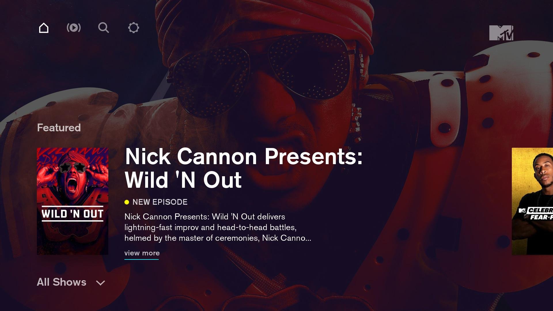
Wild’N Out - MTV Roku App
Impact
We created a seamless, easy experience that’s flexible for users across platforms where ViacomCBS content is consumed. This led to a 15% increase in downloads from the app store, averaged out across brands.
